A few diagrams from our first exercise:


Diagram from exercise 3:

Microclimate diagrams:


Diagrams from exercise 6:

This graph above shows the average monthly temperature for the month of March beginning in 1895 to the
present. Looking at the general trend, the graph seems to vary the normal amount hovering around the average 41 F. Starting in 1960 through present day, the average temperature begins to rise. This year’s average, 40.76 F, is nearly 10 F lower than the average for March, 2012 at 50.4 F. Even though the temperature for March, 2013 is much lower than 2012, it is closer to the 1901-2000 average of 41.63 F, off by 0.87 F.

Like the contiguous U.S. temperature graph, this
temperature graph, above, for the month of March in Wisconsin shows a trend that does not
change much from 1895 to around 1950. Starting in 1950, an increasing trend in
the average temperature begins to emerge. The average temperature for Wisconsin
from 1901 to 2000 is 28.9 F, 12.73 F lower than the Contiguous U.S. average.
The average for 2013 is 23.8 F, 5.1 F below the 1901-2000 average. The average
for 2012 is 45.4 F, 16.5 F higher than the 1901-2000 average. It makes sense
that Wisconsin’s average temperatures in March would be lower than those of the
Contiguous U.S. due to its geographic location.

This graph shows the average precipitation For the
contiguous U.S. for March from 1895 to present. Overall, there does not seem to
be a noticeable trend from 1895 to present. The average precipitation for March
is 2.4 inches. This year’s precipitation for March is 1.68 inches, 0.72 inches
below the average. This year’s preicp. is also less than last year’s, which was
2.7 inches.

Here are the averages for the precipitation during
March for Wisconsin. Again, there does not seem to be any trends through the
last century in regards to the years becoming wetter or drier. Both this year
and last year were wetter than average. 2012 only saw 0.4 inches more of
precipitation than this year, which received 1.95 inches. What should be noted
in the above four graphs is most of the large peaks above average in precipitation
or temperature are followed by large peaks below average.

This graph to the left shows the average temperatures of Madison,
WI and Milwaukee, WI for each month of the year. As typical of the Midwest, temperatures peak
in July and the coldest months are January and February. The coldest month for
Madison is January with a temperature of 16 F, while the warmest month, July,
has a temperature of 71 F. Milwaukee’s coldest month is also January with a
temperature of 18.9 F, while the warmest month is July with a temperature of
70.9 F.
The following graphs are
climographs of the larger cities of Wisconsin and of Minneapolis, MN. They show
the monthly average temperatures and precipitations in relation to each other.
These climographs show that the warmer months are also the most precipitous, as
the cooler months receive the least amount of precipitation.


However, the data collected for all of the cities is not all from the same source. Also, some years may be missing for some cities while for other cities those years are available, even though the data is from the same source. This would have an effect on the averages with some cities having used more years to calculate the average temp. and precip. than other cities.
The following graphs represent the daily averages of temperature, precipitation, and wind directions for the months January through April.


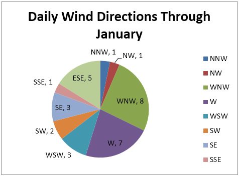


A general trend that can be seen throughout January, February, and
March are that the greatest precipitation occurred during the warmer times of
those months. The average monthly temperatures for these months were still
below 32 F, so this makes sense. Slightly warmer temperatures are associated
with low pressure systems coming through. This trend does not occur in April,
when the average temperature seems to be over 32 F. April also has the greatest
amount of total precipitation, 29.3 inches, twice as much precipitation than
January, February, and March combined.
When comparing the daily pressure diagram for April with the
climograph of Eau Claire, April seems to have exceeded the monthly average 10
times over. The precipitation for January through March was also above average.
January and February were warmer than average, where March and April were
cooler than average.
Overall, it appears that this winter, and so far this spring, was more
precipitous than average. Winter was warmer than average and spring is looking
to be cooler than average. So, all of the mid-latitude cyclones that
contributed to the precipitation we received this winter/spring is not normal,
but well above average.
From exercise 7:

No comments:
Post a Comment